BROWNIE BRITTLE
The crispy, crunchy snack with edge.
OVERVIEW
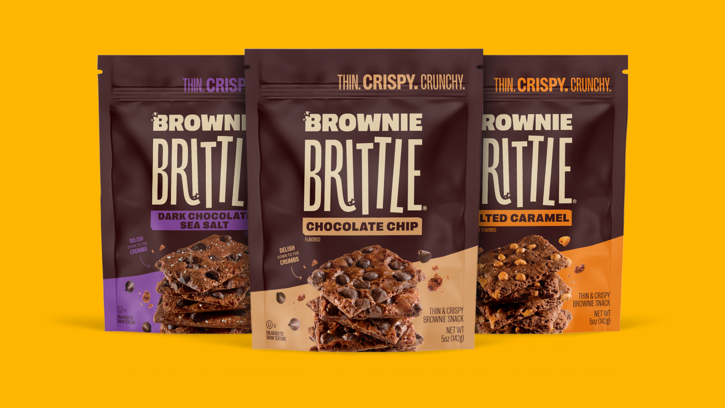
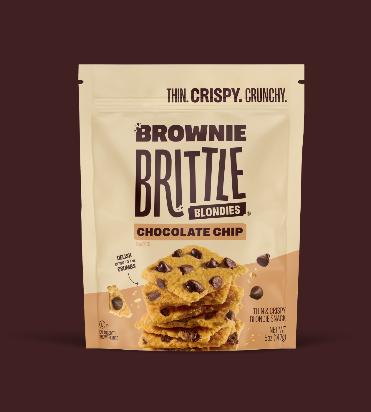
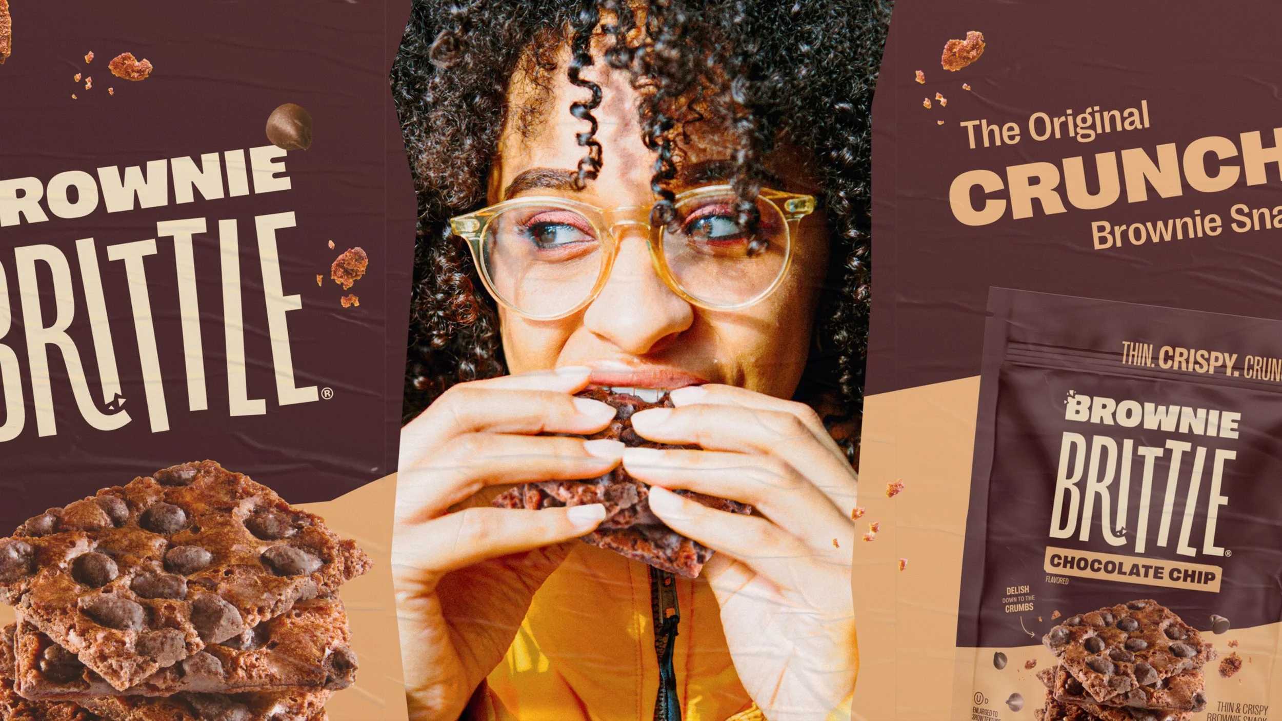
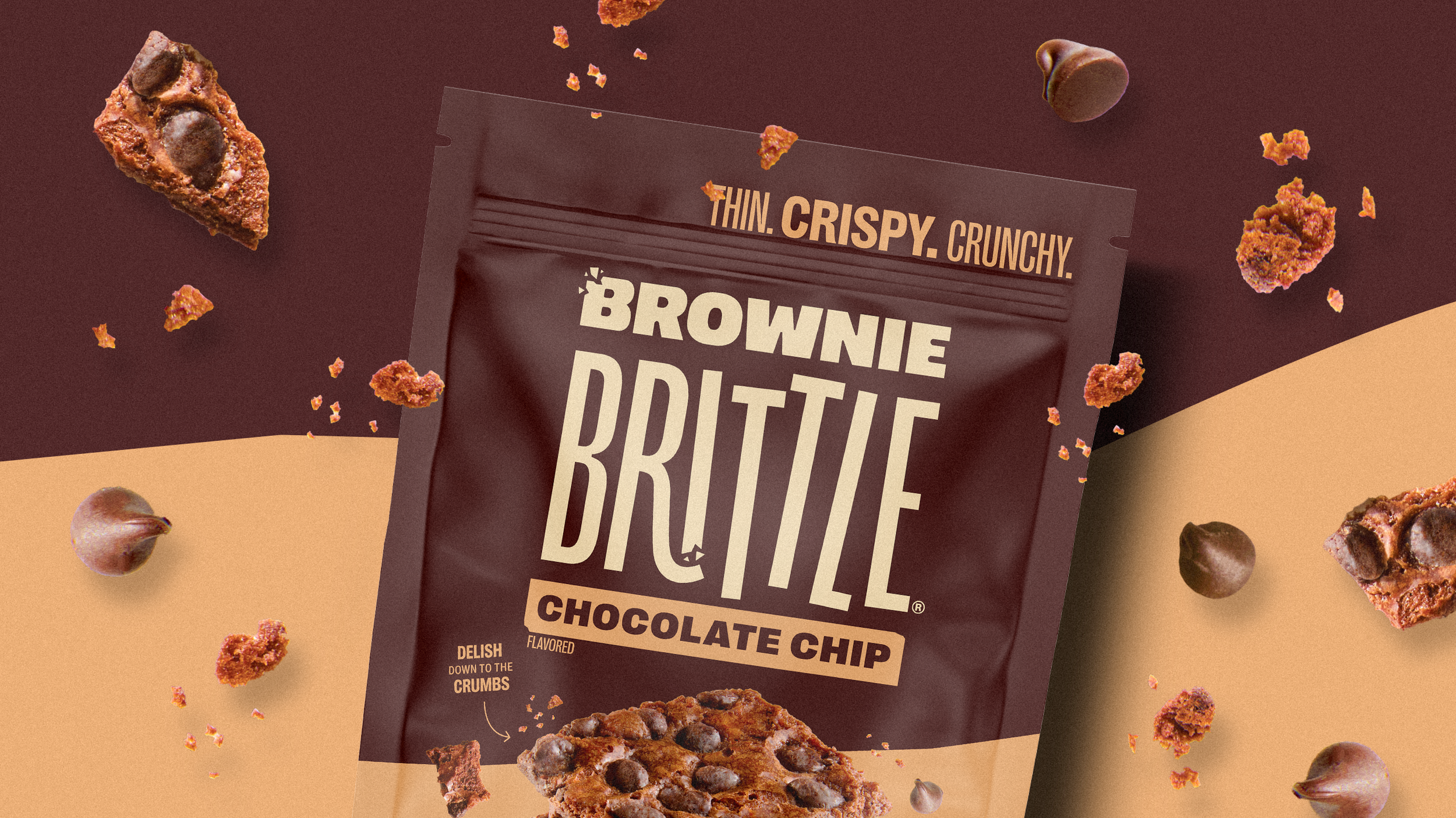
Brownie Brittle wanted to shift its identity and packaging to appeal to a younger audience while retaining its core customer base. The new look is an evolution with a system that better represents the product inside. It’s crispier, edgier, and bursting with personality! A snack you’d be proud to share at your next party.
Created 2024 / @ Skidmore Studio / browniebrittle.com
-
Logo Design
Visual Identity
Packaging System -
CD: Shawn McConnell
DESIGN: Tyler DeHague, Sarah Johnson, Mariana Rodriguez
COPY: Alyssa Smith
PHOTO: TRG Multimedia (Food), Garnish Creative Media (Lifestyle) -
Designalytics - Customers prefer new packaging 2:1 over the old.


LOGO
The custom logotype captures the product experience by blending soft, square letterforms with crisp, condensed typography.